Writing for picture books

Writing for picture books is so different to writing other kinds of fiction. The stories need to be both shorter (750 to 1000 words) and more direct. The sentences are short. Each scene needs to stand alone, but also requires a hook to get the page to turn. Usually that’s some kind of question.

Dialog moves the story along, with more show and less tell in every scene.

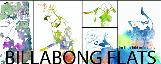
Determining what drawings to create takes a different kind of effort too. Will it be a scene, with the place as character? Will it be one of the characters who is speaking in the scene? As I’m doing my own illustrations, quite a bit of time was occupied with drawing, watercolor, creating a style for the kids books. I wanted something that was organic, dreamlike, playful, yet not too serious. Not cartoon-like, but naturalistic. Yet I wanted the color of dreams and magic to play in the illustrations. The animals needed to be ‘in the environment’ with gestural color and movement. All parts of the challenge.

At first, I thought of hiring an illustrator, however, am glad my sweetie talked me out of that idea. Getting back into sketching has been its own reward.

However, the challenge of structuring a few short sentences per page, with a maximum of 32 pages in the book has been a learning curve. More about that as I work through the steps to get it into print. Meantime, the kindle version is done. Onto the ePub and print versions next.

Writing journey side trip

BBFWebHeadWyrd.png

Billabong Flats: The Big Race – Story and images by Ria Loader, copyright 2016

As we write, sometimes the journey sometimes takes a bit of a side trip; that happened to me about three months ago. I was writing the ‘how to kindle’ book and got side tracked by a creative adventure. It started when I was writing the chapter on formatting for kindle. I wanted to show the difference between unformatted text, and how it looks when you add a bit of structure such as Chapter Heading, first paragraph with no indent and subsequent body copy. It happened that I needed a couple paragraphs of story to use for that section. Out of nowhere, the start of a children’s story sprang to mind and I scribbled it down. That began a side journey that has involved a lot of steps.

Unformatted text
The Big Race
The wild bush animals gathered at Billabong Flats, a place where everyone has fun.They met in the shade of the big gum trees.They would race to the big hill and back. Emu was there, along with Magpie and Kangaroo. Wallaby and Cockatoo, Possum and Flying Fox were there too.
End of unformatted text

Didn’t mean to procrastinate finishing the kindle book, though that’s been on hold while I’ve been caught up in a whirlwind. Finishing the story fragment above has led to learning about kids books, taking up drawing again, and writing a dozen kids stories. Sometimes, as an author, it feels like you are just along for the ride.

The place?
Billabong Flats, an imaginary place in the Australian Bush.

The characters?
Australian animal friends – Kookaburra, Koala, Kangaroo, Echidna, Cockatoo and Flying Fox, Dingo and Brolga and all the critters that run, swim, jump and fly.

The idea?
A place where everyone gets along and has fun.

The challenges?
Those of friendship everywhere. Things are lost and found, curiosity leads to new discoveries, new homes need to be found, visitors become neighbors and scary monsters are avoided or defeated, friends are supported in times of loss, and adventures and fun is had along the way.

The images?
After searching through thousands of photographs, it came down to around 200 images as inspiration. From that. pen and ink drawings were embellished with watercolor and digital brush work.

The web site?
It felt like the stories needed their own web site, so I started one at BillabongFlats.com. When friends said they wanted images of the characters, I began to set up some materials for Billabong Flats Art on Cafepress. The first image, of KoalaDreaming is ready. I’ll be asking folks who join the Billabong Flats mailing list to vote on which story and which character I put up next on cafe press. I have images of many of the animals ready to go.

The first illustrated children’s book?
It is called Billabong Flats: The Big Race. It will be out on amazon in a couple of weeks.

Book design – adjusting to digital design

It used to be that book design was a discipline where we had defined page sizes. For print, that is still the case, but how long will print be with us? When I design for print, I decide ahead of time what the size of the end product will be. It’s either 8.5 x 5 inches or it is 9 x 6 inches for a trade paperback. There are cases where I might want a different size (mini books for example) but 9 x 6 or 8.5 x 5 covers most of the cases. The margins get set predictably, with a large inside margin to account for the spine of the book. The Chapter headings start in a predictable place, and I can count on a page with 300 or 350 words per page. All those assumptions change when designing for electronic formats.

The largest change, for me, is the one in our mental model about how a book looks and feels. Instead of the design being in the hands of the producer, the choices about the ‘page’ move into the hands of the reader, literally. The person reading the book determines the font they want to see, the size of the font, the color of the page and even the brightness or contrast. It is the ultimate in user centered design experience.

There are things we can do to get in the way of the reader making their choices, but we should not do that. We need to get with the program, get onboard, and drink from the fountain of experience. There’s no putting this particular djinn back in the bottle. When we prepare our manuscripts for digital reflow, we need to be aware of the things that help our readers have a good experience.

  1. Put a section break in the word document before the chapter titles. This means each new chapter starts at the top of a new ‘page’, just like it does in a paper book. This is familiar and expected, and is therefore comforting to a person reading the book. Starting a new chapter just a couple lines after the end of an old chapter fails to give the reader pause to notice that the subject has changed. If the subject didn’t change, I have to wonder why there is a new chapter at all?
  2. Use chapter titles that are not too long. If they are long, they get ugly text-wrapping.
  3. Use a maximum of 18px size for your chapter titles to avoid line-wrapping
  4. Check that lists do not become tiny 2″ wide strips. Don’t indent them.
  5. Remove the font tags before publishing to kindle OR use a kindle-supported font like Georgia
  6. Consider putting some of the front-matter in the back of the book so a reader gets to the content as soon as they open at the title page
  7. Put your back cover blurb right up front after your cover image so a reader can see it again before reading the book. Makes a real difference to how many people engage with your book after buying it

There are likely other things you can do to help make your book more reader-friendly in digital format, however, these are a good place to start.

If you like my blog, you might like my fiction too. Join my mailing list for a free short story and very occasional updates.

Free or nearly free images for blogs and covers

infographic

From vectorstock.com

I have a bunch of sources that I use for images for blog posts and cover inspiration. For the most part, I purchase images and then modify them or resize them, however, sometimes the free sites can surprise you with incredible image content. I tend to avoid using search engines to find images for professional work though if I’m going to use one, Bing.com has better image search and categorization.

I find that having a working cover for a book or article helps focus the words. Purchase happens later on in the process, once everything is much more nailed down.

Here are few of my favorite direct sites.

  1. Morguefile
    This is a terrific free site. It is great for inspiration. The license allows you to repurpose images, combine them, modify them, or use as is. You can choose to include attribution, or not. It has a mix of photography, vector images and is great for landscapes. It may not always have book-sized images, but is great for blogs. When I was putting together a quick deck of inspirational images (3″ x 2.5″ think cards) it was one of my ‘go to’ places. I was only going to use one of each image, and for single use for a party. I like to give credit in projects where I am using something that has some distribution though.
  2. Vectorstock
    This is a low cost rather than free site. I purchase images from here for $1 each. I am a full time designer, and often need to comp up ‘directional’ images. This is a great source to save time, especially when creating quick ideas. There was recently a time when I needed high quality photographic images of various screens (desktop, laptop, tablet, hand held device) for a quick powerpoint. Zero time to draw something but Vectorstock came through like a champ. Ten minutes later I had images to use for a quick internal demo. It is also a great source for images to layer for book jacket design. You do need an account. Happily, you can use paypal to pay for credits.
  3. iStockphoto
    One price for image credits ($15) and you don’t need much more than a low-fidelity image for web use. Only good up to 499K print editions, but it’s easy to buy an extended licence if you need it. The credits expire, and you need to purchase packages. High quality offsets this little annoyance.

There are great free sites too and if you want a well-written article on the top 15 of the legal and free sites, go on over to a blog I follow – LiveGrowWrite – she has the latest scoop in her article and it weighs the pros and cons of each site.

How about sites you use?

Share your experience in the comments section. We’re all looking for good, legal and free sites to use where it’s easy to find an attributed image.

6 books published in a year: now we are six!

It’s a little crazy, right? Our tiny publishing company, Impish Press, has launched six new books in the past year. After the writing, that includes all the traditional and hybrid indie tasks of

  1. Line editing
  2. Proof reading
  3. Continuity
  4. Book design
  5. Conversion to kindle
  6. Design for print
  7. Cover design
  8. Back cover / description writing
  9. Web site design
  10. Marketing

All while I held down a full-time job at Microsoft, and Raven took care of everything with the house plus full-time writing. Admittedly, I have a past life in publishing, web development and design. However, there was guerilla time management in there, along with more than a dash of persistence. My partner is encouraging me to think about making the next book I write on how we managed to write AND publish a book every two months on average. It’s beginning to look more than likely I’ll oblige him. From what I read, short kindle books for the Do It Yourself market are a good niche.

I thought I might start with a quick guide to exactly how I format styles in word (after scrivener export) to avoid tears before bedtime when I convert to kindle. With screen shots and measurements. Think that’d be interesting?

What subjects would you like to see covered, dear readers? Use the comments section and I’ll try to answer questions.

A writer exploring her medium

It is an exciting time to be living in as an author, exploring the medium of fiction in multiple formats. The electronic book feels so ephemeral, while the trade paperback feels more lasting and tangible. Both have their charms but I am struck by how different the same work can feel in the two different mediums.

Print will always have my heart I think with the feeling of the pages, the smell of the ink, and the whole experience of interacting with an artifact. Yet my kindle has made it possible to keep a whole library with me; as long as I have a power charge, I can visit with old friends any time I like, no matter where I am. I no longer run late for work in searching for a book to add to my bag before I run out the door; it’s sad to admit how many buses I’ve missed over the years just because I couldn’t bring myself to leave before I had a book in hand. As an author, each of print and ebook is satisfying in its own way – both get into the hands of readers and that’s a happiness.

Fiction is a new departure for me and I’m as happy as a kid in the candy store. For the past twenty odd years, I’ve been focused on technical writing and non fiction. I had no idea fiction could be so rewarding! The characters are about as noisy and demanding as a screech of lyrebirds in the Australian bush. Those pesky creatures are mimics who love to make the sound of squeaky playground swings. My characters keep up the racket in my head until I get their words and stories out.

I must admit to experimenting with the novella format more than a bit; Child of Time is a story in three parts that could be considered three separate short stories. Thematically, it moves through time and explores a single protagonist as she grows up and grows into her magic. It is a single story, yes. It is also a set of stories about a character at different ages. Will be experimenting with the novella form more as time goes on. I already have ideas for another sequence of three stories, threaded together through time.

For me, it feels like around a hundred pages, or around 20,000 words is a good chunk of story. I hope that the readers agree as it means publishing is feasible as soon as there is a sequence to share in ebook and print. Less than 100 pages doesn’t feel print-worthy to me, but other folks mileage may vary.