Writing journey side trip

BBFWebHeadWyrd.png

Billabong Flats: The Big Race – Story and images by Ria Loader, copyright 2016

As we write, sometimes the journey sometimes takes a bit of a side trip; that happened to me about three months ago. I was writing the ‘how to kindle’ book and got side tracked by a creative adventure. It started when I was writing the chapter on formatting for kindle. I wanted to show the difference between unformatted text, and how it looks when you add a bit of structure such as Chapter Heading, first paragraph with no indent and subsequent body copy. It happened that I needed a couple paragraphs of story to use for that section. Out of nowhere, the start of a children’s story sprang to mind and I scribbled it down. That began a side journey that has involved a lot of steps.

Unformatted text
The Big Race
The wild bush animals gathered at Billabong Flats, a place where everyone has fun.They met in the shade of the big gum trees.They would race to the big hill and back. Emu was there, along with Magpie and Kangaroo. Wallaby and Cockatoo, Possum and Flying Fox were there too.
End of unformatted text

Didn’t mean to procrastinate finishing the kindle book, though that’s been on hold while I’ve been caught up in a whirlwind. Finishing the story fragment above has led to learning about kids books, taking up drawing again, and writing a dozen kids stories. Sometimes, as an author, it feels like you are just along for the ride.
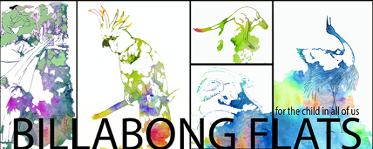
The place?
Billabong Flats, an imaginary place in the Australian Bush.

The characters?
Australian animal friends – Kookaburra, Koala, Kangaroo, Echidna, Cockatoo and Flying Fox, Dingo and Brolga and all the critters that run, swim, jump and fly.

The idea?
A place where everyone gets along and has fun.

The challenges?
Those of friendship everywhere. Things are lost and found, curiosity leads to new discoveries, new homes need to be found, visitors become neighbors and scary monsters are avoided or defeated, friends are supported in times of loss, and adventures and fun is had along the way.

The images?
After searching through thousands of photographs, it came down to around 200 images as inspiration. From that. pen and ink drawings were embellished with watercolor and digital brush work.

The web site?
It felt like the stories needed their own web site, so I started one at BillabongFlats.com. When friends said they wanted images of the characters, I began to set up some materials for Billabong Flats Art on Cafepress. The first image, of KoalaDreaming is ready. I’ll be asking folks who join the Billabong Flats mailing list to vote on which story and which character I put up next on cafe press. I have images of many of the animals ready to go.

The first illustrated children’s book?
It is called Billabong Flats: The Big Race. It will be out on amazon in a couple of weeks.

Creating vs Editing: a writer’s challenge

When I’m in the creative flow, the words come easily, without hindrance. However, when I shift over to editing mode, to polish the words, the well seems to dry up. The hypercritical internal editor does not seem to be compatible with the internal novelist. I know, I know. It’s a little weird to call them out as separate characters, however, they’re so very different. They feel like different characters in a story.

It seems like the only way to balance the two ways of perceiving is to give them their own stage. For the most part, I am tending to schedule my time month by month – a month of outlining and writing, followed by a month of editing and polishing. When I’ve tried switching between the two on the same day, neither the writing nor the editing is any good.

This is in addition to the more normal challenges of switching between being in work mode for my full-time job and carving out that two hours a day to attend to the various aspects of being a writer.

I wonder if others have the same issue? Do you have trouble switching between editing and writing?

Strong Mystery: A new book by Raven Bond

StrongMysteryWEB

Too much fun. For the past month I’ve been editing, formatting and proofing Raven’s omnibus edition Strong Mystery. The goal was to get it done in time for him to read from it at Gearcon, a Steampunk convention in Portland. He’s a guest author there. I wanted him to have physical copies to sell at the bookshop, along with his other series novel, Wind Dancer.

I’ve been coming home from work, having dinner and then sitting down again with InDesign. Later, once I’d printed it out, there seemed to be a couple weeks of redlining (marking the print out with a red pen) and fixing before it was ready to send to print. Happily, the copies arrived this week.

This week I’ve been transferring all the corrections to the Word files so I can publish to kindle. Just a few pages left and it will likely be up online tomorrow. In reading the three stories together, I realize once more what a terrific writer he is. The plots are tight, the murder mysteries play out well, and the magic system is believable. I can’t wait until he writes the next one.

Book jacket marketing

Is it better off being red? I say that because of something a friend said once. He was working in a technical book shop at the time. He claimed their marketing boffins had worked out that they sold 8% more copies of any text book with a red jacket. I’ve been wondering if that might translate to advice for designing fiction and nonfiction book jackets as well.

When I look at fantasy covers, most of them are playing with the idea of ‘hot’ by portraying semi-naked men or women (or both) on the covers. In addition, there’s often flames, or warm tones to contrast against a dark and shadowy background. Not red exactly, but heading in that direction.

Jackets for non-fiction grab your attention with neon colors, often orange and yellow or red, though there’s a good splash of acid green or neon green vying for eyeballs. The nonfiction works boast geometric shapes, diamonds and hard edges, plus more text than anyone other than an SEO guru would want to share. Don’t get me wrong … those key words help in the search algorithms on Amazon … the words work, but they sure are ugly.

It’s a balancing act. You want just enough information to satisfy the rules for sub-titles, which include a requirement to have all those words on the cover before putting them in the form on amazon. But maybe the color also makes an impact. It’s worth a bit of research. I think I’ll count the covers with red on them in the top amazon categories I’m interested in and see if that might be worth considering as a strategy. Sharing with you here to see what you think about the idea.

If you like my words, you might like my fiction. Join my mailing list to get free short stories and book release updates.

Check out my reading list on goodreads

Zip it for kindle upload

I can’t believe it took me so long to grasp the simple zip-folder necessity for kindle formatting. I kept getting those nasty ‘picture of an old-fashioned camera’ icons instead of my lovely images in the final version I downloaded or previewed. I ended up writing myself a reminder on a post-it note “zip it or lose it!” Takes a few repeats, even if those are a couple months apart, before the process sinks in.

So, for those who haven’t created their first kindle book yet, when you get there, here are the reminder steps in converting from word.

  • Save the file as web-filtered
  • Make sure the resulting file + the images are in the same folder
  • Zip the folder with the images + the web-filtered file inside
  • Make any necessary corrections to the HTML file
  • When uploading to the dashboard at KDP, choose the zip file to upload

Hopefully, next time I’ll remember. If not, there’s that handy post-it note and this reminder on my blog. Am gathering together all the cheat-sheet notes and memory tricks into a short guide to share at some point.

Bye for now – I’m headed off to work on a short story about a web designer who discovers how to add magic to her designs and code.

If you like my blog, you might like my fiction too. Join my mailing list for a free short story and very occasional updates.

10 Things I’ve learned about writing and publishing

Some of the most important things I’ve learned over the past year of writing and publishing are

  1. The first (or fifteenth) draft is not ready. It needs an editor.
  2. There are many editorial passes (characters, plot, sensory, place, continuity, tone, tightening up, grammar, spelling, formatting, design)
  3. A beta reader is worth their weight in gold. They answer questions:
    • What was unbelievable, in context of the story
    • What was confusing?
    • What did you want to see more of?
    • What was cool?
  4. Follow the directions of the publishing house – if you don’t, it will not ever get past the mail clerk. Margins, font, spacing, cover letter, synopsis (1000 words max – some prefer 350-500), elevator pitch (Firefly = A western, in space)
  5. The content of a book needs to (mostly) be in the same voice (1st person, 3rd person – it’s rarer than you’d think that it switches at all)
  6. Research is important – tell the reader where/when they are, get the facts right, especially historical facts need to be accurate)
  7. The story needs to be marketable – it needs to fit an exact niche
  8. Sensory information is important (taste, sound, smell, touch, sight)
  9. Characters have motivation, feelings, internal voices. Use them.
  10. Place can also be a character in a story.